122. CHECKLIST: What to test and break ahead of V-Day & Giving Tuesday
Swipe File - resources to find more inspiration; Jobs that took my fancy this week
A very warm welcome to all the new subscribers. I’m thrilled to have you as readers and truly appreciate your feedback and support.
Handle high-volume giving with oodles of confidence.
Remove the fear factor from fundraising on big days of giving like Veterans Day and Giving Tuesday.
Fundraise Up gives you the scale you need to effortlessly handle high volumes of giving.
Game changer? It is for me.
In this week’s SPN:
Swipe File - resources to find more inspiration
CHECKLIST: Veterans Day → Giving Tuesday
Jobs that took my fancy this week
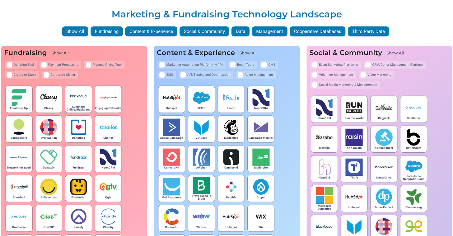
Explore: Build Your Tech Stack (link)
Searching for new tools or trying to trim down your tech stack? Play around in this infographic. I add to it most weeks.
Swipe File: Finding More Inspo
I'm constantly asked about resources to find more inspiration, especially going into Q4 where you need a high volume of assets and creative to be successful.
I wanted to share a few links from outside our sector that I look at regularly to stay up to date within the world of media, commerce, CPG, technology, content and more. This doesn’t include all the hands-on work I do on a daily basis, but it certainly adds more context.
Landing Page Examples
I frequently love looking at other landing page inspo to see what’s out in the market, what’s working, what people are testing, and what I could be doing differently or testing into. My favorite way to do this is just by clicking the ads I’m served and seeing where I’m led to, especially from channels that have a higher bounce rate, like TikTok or CTV.
CTV and TikTok landing pages tend to be the most direct-response-focused, but that’s where I like to find inspiration, knowing I can likely design it better.
When I can’t find new pages or examples right away, here are a few resources I like to use for landing page and website inspiration:
• Lapa eCommerce LP Collection
• Awwwards - This site is just UI inspo, not UX inspo; aka, I don’t believe most of these sites are conversion friendly.
• Page Flows - Great UX inspo
It’s always fun seeing featured examples that I’ve had a hand in making out in the wild as best-in-class examples!
Email Flow & Campaign Inspiration
Most Org’s tend to set up their emails, especially flows, once, and then never revisit them for months or years. There’s likely so many donations you’re leaving on the table by not rigorously optimizing your flows.
Now’s the time, in this brief moment before EOY campaigns kick off, to fully audit everything that’s automated or triggered. Is it setup to fire properly? Does it have links that contain automatic Matches? Does the pop-up fire on-site when you have traffic coming from email? Are the subject lines truly optimized? Could there be a way to swap a section of content to increase revenue or click-through rate?
Here are a couple of websites I like to use to find what different brands are doing:
• Really Good Emails - This is probably the most popular resource for finding emails from different brands.
• Good Email Copy - Exactly what it sounds like!
Campaigns make a lot of money, but you’d be surprised how much more fund raising revenue your flows can be making you.
Copywriting Inspo
Good copy will make a donor fall in love with your Org, not just want to donate to a program. I still remember when the MacBook Air first launched and the copy was “Light. Years ahead.” They always give you 2+ ways to read something, making it 10x more enjoyable.
Here are some good places I like to get copy inspo from:
• Swiped
Ad Creative Inspiration
Lastly, I want to share with you where I get some of my ad creative inspiration. Candidly, I try my best to keep going to websites of brands and Org’s that I respect from a performance marketing standpoint, and then wait to see what I get targeted with (either from them, or their competitors).
Typically, when I can’t get served something, I’ll just go check out the ad libraries I shared recently in SPN 121:
LinkedIn (go to an Org’s LinkedIn Page > Post > Ads)
Another thing with ad creative is I like to see how affiliates are marketing [differently]. They’re usually focused on driving conversion, and they tend to have a built-in audience, so their content feels more native. A good example of this is looking at what TikTok Shop affiliates are doing and how they’re advertising certain products. It pays dividends to look outside of our sector for inspo.
Here are some more resources for where I get inspiration for ads:
• Sarah Levinger’s Ad Swipe File
Honestly, the secret to finding the best ads is what I shared last week - make an Instagram DM group with 5-10 other operators, and everyone should share their favorite ads they see. That’s the only way to find the best ads, quickly.
Here’s mine from Route 101 this weekend returning from the airport. There was one about SOC 2 Compliance not “SOC’ing 2 Much” but I wasn’t quick enough with my phone. This I loved:
Jobs & Opps 🛠️
Comic Relief: Senior Fundraising Marketing Manager (£47,880 - £50,539)
UN Women: Digital Fundraising Consultant
Royal Society of Protection of Birds: Director of Supporter Fundraising (£85,000)
American Diabetes Association: Director, Digital Experience ($93,800 - $104,000)
Orbis International: Manager, Direct-Response Marketing
World Food Program USA: Senior Associate, Social Media & Engagement ($60,000 - $65,000)
Diabetes UK: Manager, Senior Media (£47,348 - £52,609)
USA UNHCR: Data Scientist ($109,474 - $119,427)
Blue State (agency): VP, Direct Response ($120,000 – $180,000)
Chobani: Head of Impact
Mattress Firm: Senior Social Impact Specialist ($75,000 - $78,000)
British Red Cross: Head of Acquisition (£66,988 (plus £3,344 Inner London Weighting, if applicable))
CHECKLIST:
Veterans Day → Giving Tuesday
Since a lot of my conversations this past week were about prepping for Veterans Day and Giving Tuesday, here’s a checklist of things to make sure you double-check and turn on to ensure smooth-sailing.
Be sure you run through these ASAP, and maybe daily for some of the testing… you never know what can just magically break overnight.
Make sure the ad creative you’re launching has matching creative on the landing page or web page it’s driving to. Just by not having a matching visual from the ad to the site page, you’re going to increase your chances of bounce rate, right away. I actually don’t mind it, but every test I’ve run around this says it matters. A lot.
Test every single button, variant selector, image preview, Match code, and Hubspot tracking script. To set something up and then assume it’s going to run as-is, with no issues, is like buying a raffle ticket and thinking you’re going to win - it’s a tad delusional.
Things break. This is the most stressful time for every single piece of your tech stack, so things will break. Just make sure you’re constantly testing things to make sure they still do what they’re supposed to.
Tag all your donors from now until the Wednesday after Giving Tuesday as GT_CyberWeek2024 donors. Next year when you’re planning your Giving Tuesday campaigns, you’ll want to know how your donors from last year did, to give yourself a better understanding of what asks and messaging worked or didn’t, from a revenue and LTV standpoint.
Also, at any point, it makes it easy to mass-communicate to your Giving Tuesday donors, especially if you’ve product you’re shipping (delays or logistical issues).
Don’t forget to push every single campaign, every day, to your organic social channels, especially TikTok, Instagram, and X. It’s very normal behavior for a prospective donor to jump to your social media to look for a Match.
Have someone talk through and explain any Match or product promotions on Instagram stories as well, not just a graphic with the match language going on. Also, don’t forget to have some sort of a link in bio that works toward a donor getting to the site and donation form.
Update your email pop-up to reflect the match that you’re pushing. If your email pop-up says “Sign up to Match your donation” during BFCM, it’s not going to convert as high as, “Unlock a Match”.
The quality of your subscriber might be slightly lower, but tag your Cyber Week emails so you can see that over time. Take advantage of the high traffic and high intent while we’re here, it’s not “off-brand.”
If you’re running paid ads, there’s a chance that you’re only running a few ads with a URL that you’ll redirect to different pages, so that you don’t have to go through the learning phase again. If you are, then triple check your page redirects on multiple devices and incognito browser windows.
Make sure you’re using a URL redirector that updates quickly.
Before you send a ton of emails or traffic, make sure you test your email renders with Litmus, and site renders with BrowserStack. You’ll likely easily catch mistakes on different browsers, devices, sizes, etc.
Triple-check that all your pixels are live, firing and collecting data on all your pages, including landing pages that might be hosted by another CMS. The FB Pixel Helper is a recent find (an official Meta product) and extension on Chrome.
Make sure that when you click a button, it verifies that it’s collecting that data. Use the extension and browse around your Org’s site, and you’ll see what I mean.
That’s all for today!
If you enjoyed this SPN, please consider sharing with your network. Thank you to those that do.
If a friend sent this to you, get the next edition of SPN by signing up below.
And huge thanks to this Quarter’s sponsor Fundraise Up for creating a new standard for online giving.
Reads From My Week
NotebookLM’s Automatically Generated Podcasts Are Surprisingly Effective (Simon Wilison)
The Best Ads of 2024 (So Far) (AdAge)
A Venture Capital Firm Does Something Rare: Give Money Back (NYT)
How Drugstore Brands Are Challenging Luxury Beauty With Price-Conscious Ads (AdWeek)
The Digital Ecosystem Isn’t Crumbling - It’s Maturing (AdExchanger)
Inside Two Years of Turmoil at Big Tech’s Anti-Terrorism Group (Wired)
Automate, Measure and Maximize: TikTok Is Building For The Future With New Performance Advertising Solutions (AdWeek)
TikTok Video For Open Web Publishers? Outbrain Built It. (AdExchanger)
The most talked about brand on social this week? “In what feels like a cross between a Van Gogh painting, a '90s MTV commercial and a rendition of a psychedelic trip, the sandwich-cookie company’s social media pages have caused a stir in recent months. Are they funny, disturbing, or cutting edge? Yes”. Nutter Butter (Delish)


