76. Some Personal News (SPN)
How to build an “audience centric” EOY reporting dashboard + Re-thinking Communication Models
A very warm welcome to all the new subscribers. I’m thrilled to have you as readers and truly appreciate your feedback and support.
‘Tis the season, so snag yourself some peace of mind and stop operating out of disparate systems. Similar to people - email, paid media and reporting all love to be connected, united and well integrated. And that’s exactly what Feathr provides.
Built specifically for nonprofits, Feathr helps Org’s know, grow, and engage their audiences with powerful AND easy-to-use digital tools.
Check them out for yourself:
In today’s SPN:
With 3M views on IG and over 1M on TikTok - this Christmas ad for Charlie’s Bar in Northern Ireland nails it.
Who needs a TV budget when you can shoot content like this on an iPhone with a budget of £700? And shed a tear of joy. Glorious.
AI developments in language translation create big opportunities to re-think Major Donor prospecting and communication.
Broken down - by page and topic - the inputs to my audience focused EOY reporting dashboard.
As with every edition of SPN please reach out with any questions or comments. I respond to every single one.
Let’s dig in!
AI: Donor Prospecting & Conversations
Beyond email support, how else are you leveraging technology in your Major Donor prospecting conversations?
Meta released a family of AI research models that allow for more natural and authentic communication across languages. Language is no longer a barrier to conversation and forming relationships.
I tried it and so can you: here - just hit the record button. How wild! And very useful.
Meta framed this latest development as “allowing people from different linguistic communities to communicate effortlessly through speech and text.” What makes it even more impressive is the speech output is almost real-time to speaking - you don’t have to wait for the translations until you finish speaking. Try it out.
What does this mean?
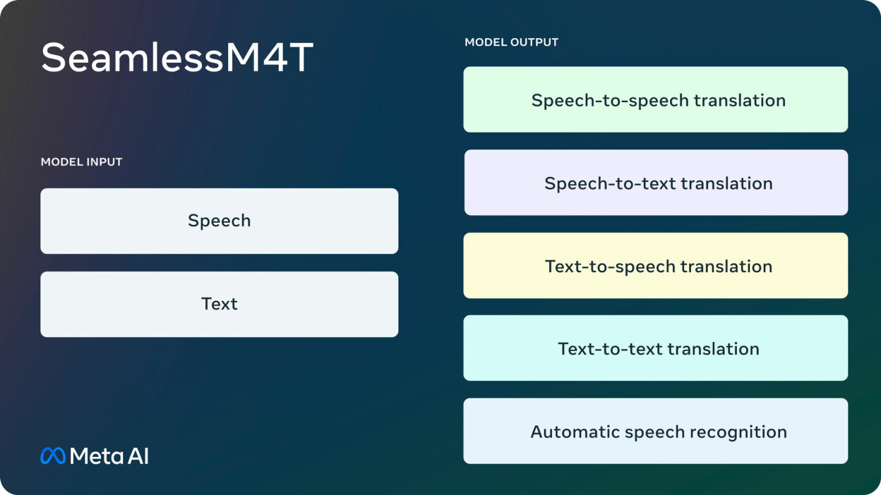
These are the 4 models. You can see on the left hand side the options are to upload text or just hit the record button and speak, and then Seamless spits out the translation in near enough real time (outputs):
SeamlessM4T v2 - The foundational model that Meta released in August.
SeamlessExpressive - A model for preserving expression in speech-to-speech translation. It keeps speech rate, pauses for rhythm, emotion and style in speech-to-speech translation between English, Spanish, German, French, Italian, and Chinese.
SeamlessStreaming - A streaming translation model for state-of-the-art results with around two seconds of latency i.e. it translates while the speaker is talking. Also, it has an impressive algorithm that decides when to keep listening and when to start translating to deal with the different sentence structure in different languages.
Seamless - SeamlessExpressive + SeamlessStreaming + SeamlessM4T v2 into one model >> here’s that example again <<
Why should you care?
Got any donors whose native language isn’t English? Or colleagues operating in different markets for that matter?
Imagine donor video calls on Instagram with these Seamless models. It’s now possible. You can chat with anyone in the world, let alone the US, without English being the qualifying barrier.
This should change how some Org’s prospect, how they develop and sustain relationships, and build brand.
Report Like a Ninja
An informed, thought-through, intuitive dashboard setup for EOY activities is like a control center at a rocket launch. Critical. Not necessarily short or simple, but logical and within reach, allowing you to identify any issues and make adjustments quickly.
The mental model for a good dashboard setup is your Donor Lifecycle.
All the graphs, charts, and tables I talk about below should be reasonably accessible from your primary source of truth – whether that’s a web analytics system, a CRM like Salesforce, a Data lake, or your reporting tool like Feathr.
Below I’ve broken down - by page and topic - how I approach building my EOY dashboard.
Page 1: Financial Summary
Page 2: Channel Summary
Page 3: Donor Lifecycle View
Pages 4 - 10’ish: Donor/Channel View (depending on the number of Donor Cohorts you identify)
So, without further ado, first up is Page 1: Financial Summary
Objective: Overall health of the Org showing combined performance, spotting early anomalies.
This will be the shortest page of your dashboard, helping you spot any early deviations from typical seasonal trends. The purpose of this page is not to show the totals (whether Revenue or Visits) but the “shape of the curve.”
Take a 30,000-foot view. Start with the most important metric - Total Funds Raised – and work down from there.
Show a time series chart detailing weekly YoY revenue. Change the dimensionality to be daily for the second half of December and hourly for the most important days for your Org (representing more than 5% of annual funds raised).
Use the same time series, showing a breakout of visits to the Donation Page and overall visitation to the website.
Break it down into New and Returning visitors.
*Insider tip: Seasonal patterns depend more on the week-day, week-end, and Christmas events than the date itself.
So up until December 25th, any YoY comparison should be based on the “Day of the Week” (as in Monday 12/18/23 vs. Monday 12/19/22).
Between 12/25 and 12/31, switch to “Date” - as in 12/30/23 vs 12/30/22.
Page 2: By Channel Summary
Objective: Health by channel, not yet broken down into stages of the Donor Lifecycle.
Take a 20,000-foot view. Combined Pages 2 and 3 will keep you in control of anything going wrong, allowing you to quickly narrow the scope of changes in case anything goes wrong.
Build several time series charts showing weekly YoY revenue by your most important channels.
I usually differentiate Programmatic / Display, Video, Paid Social, Paid Search, Email, and then put Organic + Direct together.
A double donut chart showing the share of each channel in the total revenue this year vs last year.
Several single-number boxes, showing by-channel Average Donation Value (ADV) vs YoY.
A “website health” chart showing cohorts moving from the Homepage to the Cause pages, the Donation page, and the Thank You page / successful donation.
This page should provide a quick view of channel behavior and ensure it stays aligned with annual trends. The website health report will highlight any excessive fall-out after donors hit your website.
But keep reading – if any of the trends seem out of step, nothing is conclusive without the next page…
Page 3: Donor Lifecycle View (and isolating problems)
Objective: Move away from traditional per-channel reporting. Move toward a Donor view.
Now descend to a 10,000-foot view and look at the same data from a different viewpoint. This page is arguably the most important in helping you make the right choices about any changes.
- Include several time series – or a table for a specific time frame – looking at Revenue and Web visits by the most critical donor groups →
New Visitors
Returning Visitors yet to donate
Existing donors who donate up to several times with no regularity
Previous EOY donors not contributing in-between
Existing regular donors (monthly included)
Lapsed donors who stopped donating beyond a specific time ago, as defined by your organization
Some Org’s may like to separately call out their existing Major donors here who contributed over a certain amount in a previous EOY season
- Website health report, broken out by the same groups of donors.
Troubleshooting
Should any of the revenue trends be off, triangulating the data on Pages 2 and 3 will allow you to make a crucial choice - whether the problem is channel-specific or cohort-specific. Seeing that revenue is off in Paid Search as a channel – and only in Paid Search, for example – isn’t enough to call the exact problem. Page 3 should provide the crucial insight.
Suppose trends are similar across all of the donor segments. In that case, it likely highlights technical issues within the Paid Search channel – too low bids, too many lost auctions, low Ad Quality scores - requiring the team to dig into the technicalities of the setup, while reallocating the budget to other channels in the meantime to minimize the negative revenue consequences.
If a particular group of donors is proportionally way off the charts, for example Previous EOY Donors, it’s more likely to be a Messaging problem, requiring your creative team to dig into the messaging. Again, the team will need to reallocate the budget to other segments performing stronger while the messaging is being updated.
Pages 4+: Donor Behavior View
Objective: Dig into the crossroads of cohort behavior and identify specific campaigns that need adjusted.
These pages are the “real money” ones. They’ll go deep into the specifics of the behavior of individual donor cohorts.
For each donor group from Page 3:
Include several time series – or a table for a specific time frame – looking at Revenue and Web visits driven by a particular channel, separate for the First Touch and Most Recent (~Last Touch) visits.
Donut chart showing the overall presence of each channel at each step in the journey (Homepage, Cause pages, Donation pages, and Thank You pages).
Cost per Action by channel – where Action is defined as the cost of moving the donor from this cohort to the next step of the journey.
Donut chart showing YoY breakout of Causes donors of this cohort contribute to.
Donut chart showing YoY breakout of ADV for each of the Causes donors of this cohort contribute to.
These individual “donor cohort” pages will help you further dig into the specifics – and assume the reasons – for any revenue shortfalls identified by combining pages 2 and 3.
Wrapping Up
Of course, the above 7-10 pages (depending on the number of Donor Cohorts you identify) won’t answer alllllll the questions that arise during EOY fundraising season.
Hopefully they answer 80% of those questions though – and can be further used for more comprehensive analysis e.g. predicting EOY revenue by donor behavior or building the budget plan for the next year’s campaigns.
Don’t hesitate to email me with any questions or clarifications. Thank you to those that do!
And, don’t forget to check out the Feathr platform.
I’ll see you next Sunday!
Now onto the fun stuff.
Reads of My Week
Addressing the Direct Impact of the UK’s Arts Sector.
Meta: Seamless Communication Release.
Advertising is Dead. Long Live Advertising.
Google AdSense Moving to Per-Impression Payments in 2024.
How Would Generative AI Be Used in Retail?
TikTok Users Sent $250M+ Worth of Digital Gifts to US Livestreamers in Q3 2023.
Why Mozilla Is Betting On a Decentralized Social Networking Future.
United Airlines Weighs Using Passenger Data to Sell Targeted Ads.
Boomers are doing more scrolling and shopping.


