


Some Personal News
#38 "I hope every media buying agency adopts this approach. Why wouldn’t they?" + Doing More with Less + AdTech

Happy Sunday. To those I spoke to this week or spent time with in-person - thank you. A very warm welcome to all the new subscribers. I’m thrilled to have you as readers and truly appreciate your feedback and support.
Let’s dig in.
Adtech
This week Amazon partnered with Pinterest to bring ads to the platform - more inventory for Amazon and a better route to revenue for Pinterest who have been trying to build their ad business over recent years. It’s interesting that the Pinterest announcement bills this as their first partner for third party ads. I’m keen to put some paid media onto the platform and see what results I can drive.
Some other partnerships announced this week - Criteo expanded their integration with Shopify and the Trade Desk partnered with Attain as a way to improve attribution. Important consideration here - does average quality data support people buying average quality inventory? The great thing about both Merchant Media and newTV is that they have first grade inventory available directly from trusted firms - why try and save a small amount of money by buying second rate?
This hunger for cheap inventory is what leads to the mess some of AdTech is in - like this example of a SSP effectively ignoring GDPR, through a default setting that precluded the usual checks. It’s quite arcane tech but the implications could be significant.
More on the cesspit of digital ads with this thorough look at Made for Advertising sites. These sites get 12% of programmatic display ad spend - billions of dollars - on ads never seen by a real person. The article also contains great insight and good advice on how to avoid wasting money on these sites.
The link also includes another super helpful resource - a chat GPT tool that automatically takes screenshots of ads. This solves a big problem. If I could show you where your ads are appearing I’m sure you’d act to stop this waste of money.
At the end of the article the author shares the code for this Chat GPT tool for screen-shotting. I hope every media buying agency adopts this approach. Why wouldn’t they?
Lower Cost, Focus on Conversion
One way I’ve met growth targets in the past isn’t by increasing the budget. Instead I’ve reallocated it between channels and audiences depending on where we were seeing engagement and conversion. That approach has stood me in good stead in the past six months as budgets have been revised and the economy dances to its own beat.
I’ve thought deeply about doing more with less lately. And it got me thinking about acquisition funnels, which are pretty universally applicable whether you’re a small non-profit or you’re doing $500M a year.
Here are the key components and an exercise of sorts:
A killer ask
Social proof
Program work
FAQ
1P data capture
F-Shaped UX
Accent elements
I’m a fan of using the homepage for this since it should be the most optimized landing page (LP) you use and constantly evolving based on your learnings from all your LPs. Especially as a bigger brand, when you’re on channels that don’t always have a direct click to the site, your homepage should be the net that catches and ensures everyone knows where they can go.
The Ask
The ask you put out to new donors needs to make sense to your donors, not make sense to you. Match language, product positioning, program insights shouldn’t take more than 5 seconds to read and process. Anything longer, and you’re at high risk for abandonment.
In publicizing your ask, know what you’re trying to curate and sell to a new donor, why you’re pushing that ask, and how that ask plays a role in the donor's world. With LPs, I keep the offers very custom to the audience we’re going after. But with homepages, you want to think one level above the individual personas and more broadly. Outside of any emergency fundraising topic, for example, what ask can you push that you know has the highest chance of converting a new donor?
Social Proof
This is where you help remove the barrier to convert in people’s minds. The entire job of social proof is to tell people, “Hey, it makes sense to donate because look at all the other really smart and sophisticated people and media publishers and brand influencers that love this org, and here’s why.”
With that in mind, you can choose the exact quotes, partner logos, snippets, etc to publish as your social proof. You want social proof every few sections of the page. It’s like a constant reminder over the shoulder of safety.
Donor reviews are another amazing form of social proof for your site. The best reviews are ones that you can’t fake. Things like real tweets showing love for your product or program, IG posts from happy donors showing you off, or embedded TikTok videos from random donors.
Side note: Donor content is also great at highlighting what people are surprised about most, which signals what you should focus more on in your marketing as a brand.
Donate Sections
The “shoppable” sections should occur at least twice on the homepage. The first one should focus on your Ask - what you think most people have come for on their own. The second section can be more of a carousel, highlighting program examples or products if you have them that someone can shop.
If you have multiple products to display, make sure to show them in an organized grid. Include: product titles, review counts, the review stars, pricing, and “best seller” or “award winner” labels, and make all of it clickable to the PDP (product detail page). I’ve seen many “dead clicks” happen in this section because not all of the elements automatically lead to the PDP.
In these shoppable sections, you also want to constantly reiterate the benefits of your work. Use iconography to help explain visually quicker.
FAQ
The next must-have is an FAQ section.
Every single FAQ should answer these simple questions.
If I donate, when will the recipient receive the benefit?
How do you handle canceling a monthly gift?
What makes your programs/proposition different and better?
How are you funded?
How are you accountable for your work?
Not having an FAQ is an easy way not to achieve a donation. Just answer these questions and your donors will feel like they have everything they need to make an informed donation to your brand.
1st Party Data Capture
If you’re getting traffic to your site and not doing all that you can to capture email addresses, then you’re leaving money on the table, and that’s on you.
The vast majority of people who visit your homepage aren’t going to donate on the first visit (or ever) and many won’t subscribe to your emails but if you’re sending paid traffic, you’re doing yourself a disservice if you don’t add an email popup to your homepage.
The best email pop-ups aren’t just a one-step collection, they also get one level of zero-party data. When you ask a web visitor to submit their email into the pop-up, have them also select why they’re there in the first place. This data can then route prospects or donors into more specialized email flows, increasing your chance of a conversion.
Pro tip: Any time you run an appeal or Match on your site, complement that offer text in your email pop-up.
F-Shaped UX
In 2006, Nielsen first released its study into the web's F-shaped reading pattern. The study showed that readers look horizontally first, then up and down vertically, then horizontally again, forming an F-shaped pattern with their eyes on the page. You have strong buy-in at the top but very quickly lose the attention. Your most eye-catching information needs to fall into the F.
With the F shape in mind, I’d place the text on the top left, an image on the top right, and key icons/headers on the left side as your visitors scan down the page. In every section, you should re-apply the thinking of the F-shaped scanning.
Accent Elements
Beyond the sections I mentioned above, the finishing touches are all about adding accent elements like slick icons, videos, animations, etc.
Sharing your homepage is like giving a keynote about your brand to a stadium of 1,000 or 10,000, or 100,000+ people.
» Some questions remain top of mind:
Where can you use icons instead of words?
Where can you use illustrations, photos, videos, or donor generated content instead of text?
Where can you add some design flare that really makes the page pop?
Where can you swap out value propositions to become benefits?
Are you leaving any room for uncertainty?
Are you creating the picture of the brand someone is excited to become a part of?
And there you have it. Focus on CVR over almost everything else. If you want to lower your cost per acquisition (CPA) everything needs to be rethought. And not just what’s happening on the traffic side of things. Everything from the website to the email capture and the subject lines of the sequence to how the education is laid out on the page you send traffic to.
Framework: Creating Video Ads on a Shoestring Budget
Here’s the process and framework I’ve built to find winning ads on a small budget.
There are 5 steps to it and it works in a loop:
Step 1: Research
Step 2: Brainstorm
Step 3: Create
Step 4: Launch & gather data
Step 5: Analyze & optimize
Then, the loop starts all over again. Let’s look at each individual step.
Step 1: Research
The first step is to do thorough research so you can instantly see what’s working and what isn’t.
You want to identify trends, angles, hooks, calls to actions etc. Look at what your peers are putting into the market and also some DTC/ecomm brands for good measure. Checking out their winning ads is a massive shortcut to success.
There’s no need to reinvent the wheel.
Here are some competitor intelligence tools I’ve used:
VidTao (video specific)
Try the following:
Type an org name into Google search
Click the 3 dots icon/drop down menu right after the URL
Click “see more ads from this advertiser”
Final step: select date range, location and ad format
Result > you’ll see all text ads, all video ads, all image ads
Create a database (swipefile) of ads that got your attention online and analyze what makes them stand out. Model these ads and create your own variations of improved ads (make iterations to stand out).
Step 2: Brainstorm
After researching, move into brainstorming new ideas:
Brainstorm what ads you want to create.
Create a list of angles, hooks, storylines, offers, video lengths etc.
Use your research to fuel creative ideas.
If possible, brainstorm with your team to get more ideas faster.
Again, don’t try to reinvent the wheel. Look at what’s already working for others and try to improve on that.
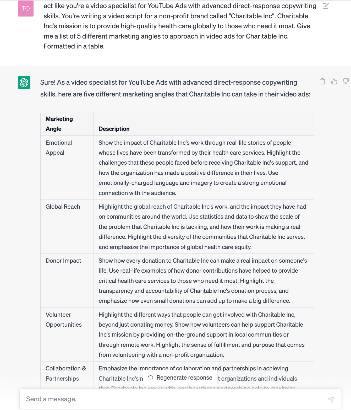
Quick tip: use ChatGPT to speed up this process by 10X. Ask for marketing angles, hooks, storylines, CTAs etc., like in this example:
Step 3: Create
After researching and brainstorming ideas, it’s time to create your first video ad. Most advertisers make the mistake of skipping step 1 and 2 and create ads straight away. Do NOT fall into the same trap.
Let ChatGPT write a video ad script for you for free:
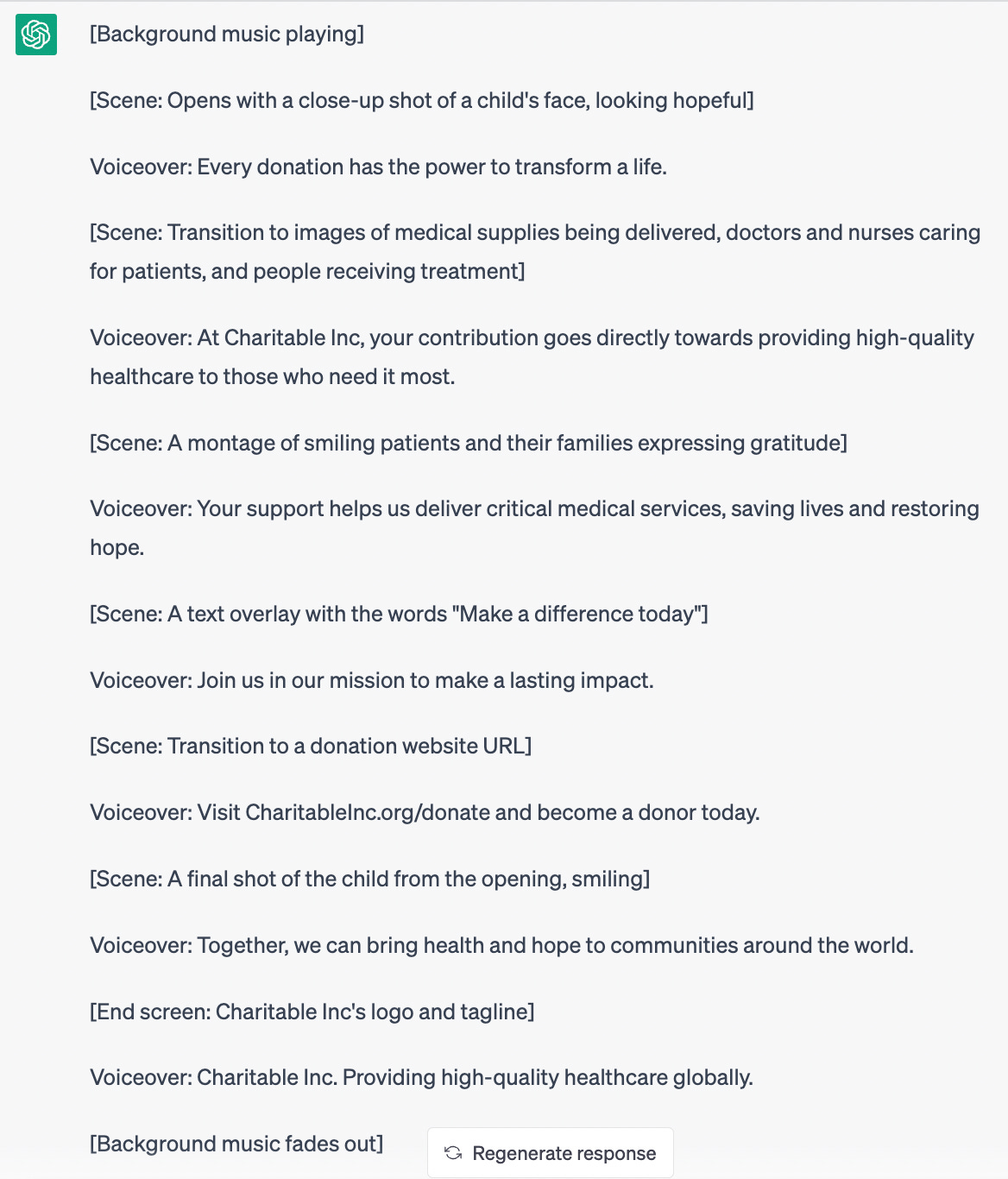
There’s room for improvement but this gives you a tremendous head start. Make sure that the first few videos are low cost to allow yourself to make mistakes and learn what works and what doesn’t. If an ad performed badly, you haven’t wasted a ton of budget on an expensive video.
The goal with your first video(s) is not to hit a home-run and scale it to the moon. The goal is to find winning angles and hooks that you can use to create better performing videos down the road (with higher production value).
Consider the below:
Hire someone on Fiverr (use your own clips and not stock footage).
Make a donor generated content compilation (make sure you have the rights to use the clips).
Use templates from the Google Ads interface (these tend to be basic but helpful).
Step 4: Launch & Gather Data
The next logical step is to launch your ads and gather some data. Don’t touch them in the beginning. How long you need to gather data depends on your volumes and spend levels. In general, give it at least 4-7 days.
The goal is to find proof of concept and identify winning angles and hooks that you can later iterate on and improve.
Step 5: Analyze & Optimize
The last step is to analyze what worked and what didn’t. Make notes and optimize your ads by creating iterations (different hooks, angles, CTAs, pacing etc.). It’s a constant process of iterating and improving.
Good Reads this Week
Uncomfortable reading: Global Report on Food Crises.
Microsoft wrote a guide to ‘prompt engineering’ (which always seems to be in conflict with the idea that these things use natural language).
S4Capital’s annual report is always well put together and insightful: “It's happening now”.
WPP agency Wunderman Future 100 - 100 trends to watch in the coming year.
iTunes Music Store turns 20: The lasting legacy of the Free Single of the Week.
Generative AI and a personalized education.
Jobs and Opps
American Advertising Assoc: SVP, MarTech
Anti-Slavery: Digital Mobilization Officer
Hindu American: Director of Social Media
Médecins Sans Frontières/Doctors Without Borders (MSF UK): Media Team Lead
National Geographic Society: VP, Membership
National Recreation and Parks: Director Marketing and Engagement Strategy
Water Aid (UK): Digital Product Lead
Thank you for reading Some Personal News
How can I help you? I use my experience, expertise and network to help mission-driven organizations solve interesting problems and grow.